Showing posts with label Css Menus. Show all posts

Responsive jquery mobile menu

Responsive Mobile Menu Tutorrial for web designers and developers. Using this code you can easily make a responsive mobile menu for your website. In this tutorial i'm using some jquery code and css media queries.

Responsive jquery mobile menu

CSS CODE

body{margin:0px;padding:0px;font-family:Arial, Helvetica, sans-serif;font-size:13px;}
#mob-menu{display:none;height:40px;background:#0066cc url(https://blogger.googleusercontent.com/img/b/R29vZ2xl/AVvXsEjuNRaprh4nT1TeiEK3kc_Uf9T8HG8GsFepboCNlfpDnt2Yg74wPxJoKIHGlQ6gqqD18SeYfeTF6A0kmq5_Lkep4LDHqyEvhhNk-N_3tkGxy-a0g8ijf0C7dkunu-FwYz6YYyuh2sk7tkKU/s1600/menu-bg.png) 10px 8px no-repeat;color:#fff;line-height:40px;font-size:16px;width:100%;text-indent:50px;cursor:pointer;}
#nav{display:table;margin:auto;}
#nav ul{margin:20px 0px 0px 0px;padding:0px;list-style:none;height:40px;background:#06C;}
#nav ul li{float:left;}
#nav ul li a{display:block;height:40px;line-height:40px;color:#fff;font-size:16px;text-decoration:none;padding:0px 15px;}
#nav ul li a:hover{background:#222;}
@media screen and (max-width:768px)
{
 body{padding-top:40px;}
 #mob-menu{display:block;}
 #mob-menu{position:fixed;top:0px;}
 #nav ul{position:absolute;width:100%;margin:0px;height:auto;display:none;left:0px;top:40px;background:#222;}
 #nav ul li{float:none;border-bottom:solid 1px #333;}
 #nav ul li a:hover{background:#444;}
}

Jquery Code

$(function(){
  $('#mob-menu').on('click', function(e) {
    e.preventDefault();
    $('ul').slideToggle();
   });

 });

HTML Code

Menu

Responsive Mobile Menu

Download File Used in this example
Total Downloads:

Window 8 Style Menu In CSS

Make Window 8 style Menu in css3.Just copy and paste this code and use it into your website

CSS CODE

Window 8 Style Menu In CSS


#menu-wrapper
{
 background:#fff;
 width:500px;
}
#menu
{
 margin:0px;
 padding:0px;
 list-style:none;
}
#menu li
{
 display:table;
 width:150px;
 height:150px;
 background:#000;
 float:left;
 margin:5px;
}
#menu li a
{
 display:table-cell;
 text-align:center;
 vertical-align:middle;
 color:#fff;
 text-decoration:none;
 font-family:Arial, Helvetica, sans-serif;
 opacity:.5;
 transition:all .3s linear;
 -webkit-transition:all .3s linear;
 -moz-transition:all .3s linear;
 -o-transition:all .3s linear;
 -ms-transition:all .3s linear;
}
#menu li a:hover
{
 opacity:1;
}
.yellow
{
 background:#f2c828;
}
.green
{
 background:#96c11f;
}
.pink
{
 background:#e61c67;
}
.blue
{
 background:#009fe3;
}
.purple
{
 background:#544391;
}
.orange
{
 background:#d96802;
}

HTML CODE


Download File Used in this example View Live Demo
Total Downloads:

How to make animated vertical menu in css

Want to make animated vertical menu in css with jquery then this is the best and simple tutorial for you, just go through it and enjoy the coding !
How to make animated vertical menu in css

CSS CODE

#verticle-menu
{
 list-style-image:url(https://blogger.googleusercontent.com/img/b/R29vZ2xl/AVvXsEhcDHJypQTgV8hkw8ipjbiBecKj00NbBm8d63KSdnlAdBiTBezTS2gNh8w8BMYaLPw6KwUEP8d1CmLpF4A2VkS635lkE_aDc7q5zM5W3VEcR_Ue9ij1rrJ_Oocv0q4gOQ-0PGJaoQhDsaAy/s0-U-I/list-icon.png);
}
#verticle-menu li
{
margin:5px 0px; 
}
#verticle-menu li a
{
 text-decoration:none;
 color:#333;
 font-family:Arial, Helvetica, sans-serif;
 font-size:13px;
}
#verticle-menu li a:hover
{
 font-weight:bold;
}

JQUERY CODE


HTML CODE


Download File Used in this example View Live Demo
Total Downloads:

Fancy Animated Menu In Css And Jquery

Fancy Animated menu with CSS and Jquery, Simple code for animating menu just copy and paste this code into your website

Fancy Animated Menu In Css And Jquery

CSS CODE

#menu
{
 margin:0px;
 padding:0px;
 list-style:none;
 font-family:Verdana, Geneva, sans-serif;
 border:solid 2px #532b04;
 height:40px;
 display:table;
 overflow:hidden;
}
#menu li
{
 float:left;
}
#menu li a
{
 height:40px;
 display:block;
 overflow:hidden;
 text-decoration:none;
}
#menu li a span.one
{
 text-decoration:none;
 display:block;
 height:40px;
 line-height:40px;
 background: #ffb76b; /* Old browsers */
background: -moz-linear-gradient(top,  #ffb76b 0%, #ffa73d 50%, #ff7c00 51%, #ff7f04 100%); /* FF3.6+ */
background: -webkit-gradient(linear, left top, left bottom, color-stop(0%,#ffb76b), color-stop(50%,#ffa73d), color-stop(51%,#ff7c00), color-stop(100%,#ff7f04)); /* Chrome,Safari4+ */
background: -webkit-linear-gradient(top,  #ffb76b 0%,#ffa73d 50%,#ff7c00 51%,#ff7f04 100%); /* Chrome10+,Safari5.1+ */
background: -o-linear-gradient(top,  #ffb76b 0%,#ffa73d 50%,#ff7c00 51%,#ff7f04 100%); /* Opera 11.10+ */
background: -ms-linear-gradient(top,  #ffb76b 0%,#ffa73d 50%,#ff7c00 51%,#ff7f04 100%); /* IE10+ */
background: linear-gradient(to bottom,  #ffb76b 0%,#ffa73d 50%,#ff7c00 51%,#ff7f04 100%); /* W3C */
filter: progid:DXImageTransform.Microsoft.gradient( startColorstr='#ffb76b', endColorstr='#ff7f04',GradientType=0 ); /* IE6-9 */
color:#532b04;
font-weight:bold;
text-shadow:1px 1px 1px #fff;
padding:0px 20px;
font-size:14px;
border-right:solid 1px #532b04;
position:relative;

}
#menu li a span.two
{
 text-decoration:none;
 display:block;
 height:40px;
 line-height:40px;
 background: #ffb76b; /* Old browsers */
background: #aebcbf; /* Old browsers */
background: -moz-linear-gradient(top,  #aebcbf 0%, #6e7774 50%, #0a0e0a 51%, #0a0809 100%); /* FF3.6+ */
background: -webkit-gradient(linear, left top, left bottom, color-stop(0%,#aebcbf), color-stop(50%,#6e7774), color-stop(51%,#0a0e0a), color-stop(100%,#0a0809)); /* Chrome,Safari4+ */
background: -webkit-linear-gradient(top,  #aebcbf 0%,#6e7774 50%,#0a0e0a 51%,#0a0809 100%); /* Chrome10+,Safari5.1+ */
background: -o-linear-gradient(top,  #aebcbf 0%,#6e7774 50%,#0a0e0a 51%,#0a0809 100%); /* Opera 11.10+ */
background: -ms-linear-gradient(top,  #aebcbf 0%,#6e7774 50%,#0a0e0a 51%,#0a0809 100%); /* IE10+ */
background: linear-gradient(to bottom,  #aebcbf 0%,#6e7774 50%,#0a0e0a 51%,#0a0809 100%); /* W3C */
filter: progid:DXImageTransform.Microsoft.gradient( startColorstr='#aebcbf', endColorstr='#0a0809',GradientType=0 ); /* IE6-9 */

color:#fff;
font-weight:bold;
text-shadow:1px 1px 1px #000;
padding:0px 20px;
font-size:14px;
border-right:solid 1px #532b04;
}

JQUERY CODE


Download File Used in this example View Live Demo
Total Downloads:

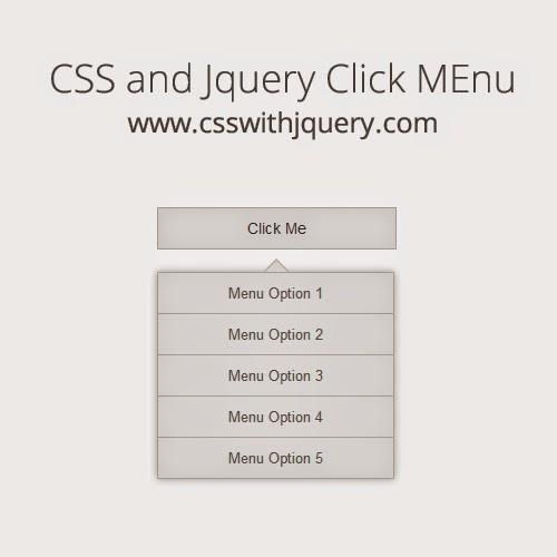
CSS and Jquery Onclick Menu

Have a look at this cool CSS and Jquery Onclick Menu. This simple and clean look menu gives your website a standard look and feel. just copy and paste the code or download fileused in this example to embed this menu to your website

CSS and Jquery Onclick Menu

CSS CODE

.click-menu
{
 font-family:Arial, Helvetica, sans-serif;
}
.click-menu a.click-link
{
 display:inline-block;
 background:#eee;
 font-size:14px;
 text-decoration:none;
 color:#333;
 padding:10px 80px;
 border:solid 1px #ccc;
}
.click-menu .click-menu-drop-down{display:none;}
.click-menu ul
{
display:table;
position:relative;
list-style:none;
margin:20px 0px 0px 0px;
padding:0px;
box-shadow:0px 0px 10px #ccc;
}
.click-menu ul li a
{
 background:#eee;
 display:block;
 padding:10px 63px;
 border:solid 1px #ccc;
 border-bottom:none;
 color:#666;
 text-decoration:none;
 font-family:Arial, Helvetica, sans-serif;
 font-size:13px;
 
}
.click-menu ul li a:hover
{
 background:#d9d8d8;
}
.click-menu ul li:last-child a{border-bottom:solid 1px #ccc;}
.click-menu ul:after, .click-menu ul:before {
 bottom: 100%;
 left: 50%;
 border: solid transparent;
 content: " ";
 height: 0;
 width: 0;
 position: absolute;
 pointer-events: none;
}

.click-menu ul:after {
 border-color: rgba(136, 183, 213, 0);
 border-bottom-color: #eee;
 border-width: 10px;
 margin-left: -10px;
}
.click-menu ul:before {
 border-color: rgba(194, 225, 245, 0);
 border-bottom-color: #d9d8d8;
 border-width: 12px;
 margin-left: -12px;
}

JQUERY CODE


HTML CODE


Download File Used in this example View Live Demo
Total Downloads:

Css Animated Menu

Very simple Css Animated Menu. Make your navigation beautifull with this css code. Try it !

Css Animated Menu

CSS CODE

#menu
{
 margin:0px;
 padding:0px;
 list-style:none;
 background:#000;
 height:40px;
 display:table;
}
#menu li
{
 float:left;
}
#menu li a
{
 display:block;
 height:40px;
 line-height:40px;
 font-size:16px;
 font-family:Arial, Helvetica, sans-serif;
 color:#fff;
 text-decoration:none;
 background:#396;
 border-top:solid 3px #000;
 border-bottom:solid 3px #000;
 padding:0px 30px; -webkit-transition: all .3s ease-out; 
   -moz-transition: all .3s ease-out; 
   -o-transition: all .3s ease-out; 
   transition: all .3s ease-out;
}
#menu li a:hover
{  -moz-transform: scale(1.2);
   -webkit-transform: scale(1.2);
   -o-transform: scale(1.2);
   transform: scale(1.2);
   -ms-transform: scale(1.2);
filter: progid:DXImageTransform.Microsoft.Matrix(sizingMethod='auto expand',
   M11=1.2, M12=-0, M21=0, M22=1.2);
}

HTML CODE


Download File Used in this example View Live Demo
Total Downloads:

Pure CSS3 Horizontal Menu

Add these stylish Pure CSS3 Horizontal Menu to your websites. learn how to create these menus just copy and paste code into website and enjot these menus.

Pure CSS3 Horizontal Menu

CSS3

#menu1
{
 display:table;
 margin:0px;
 padding:0px;
 list-style:none;
 background-image: -webkit-gradient(
 linear,
 left top,
 left bottom,
 color-stop(0, #ED0909),
 color-stop(1, #D13483)
);
background-image: -o-linear-gradient(bottom, #ED0909 0%, #D13483 100%);
background-image: -moz-linear-gradient(bottom, #ED0909 0%, #D13483 100%);
background-image: -webkit-linear-gradient(bottom, #ED0909 0%, #D13483 100%);
background-image: -ms-linear-gradient(bottom, #ED0909 0%, #D13483 100%);
background-image: linear-gradient(to bottom, #ED0909 0%, #D13483 100%);

}

#menu1 li
{
 float:left;
}
#menu1 li a
{
 
 display:block;
 text-decoration:none;
 color:#fff;
 font-family:Arial, Helvetica, sans-serif;
 height:50px;
 line-height:50px;
 padding:0px 30px;
 border-bottom:solid 3px #eb0c12;
 
}
#menu1 li a:hover
{
 background-image: -webkit-gradient(
 linear,
 left top,
 left bottom,
 color-stop(0, #1F1D1D),
 color-stop(1, #000000)
);
background-image: -o-linear-gradient(bottom, #1F1D1D 0%, #000000 100%);
background-image: -moz-linear-gradient(bottom, #1F1D1D 0%, #000000 100%);
background-image: -webkit-linear-gradient(bottom, #1F1D1D 0%, #000000 100%);
background-image: -ms-linear-gradient(bottom, #1F1D1D 0%, #000000 100%);
background-image: linear-gradient(to bottom, #1F1D1D 0%, #000000 100%);
border-bottom:solid 3px #000;


}

#menu2
{
 display:table;
 margin:0px;
 padding:0px;
 list-style:none;
 Code

Copy
background-image: -webkit-gradient(
 linear,
 left top,
 left bottom,
 color-stop(0, #5809A1),
 color-stop(1, #340A5E)
);
background-image: -o-linear-gradient(bottom, #5809A1 0%, #340A5E 100%);
background-image: -moz-linear-gradient(bottom, #5809A1 0%, #340A5E 100%);
background-image: -webkit-linear-gradient(bottom, #5809A1 0%, #340A5E 100%);
background-image: -ms-linear-gradient(bottom, #5809A1 0%, #340A5E 100%);

}

#menu2 li
{
 float:left;
}
#menu2 li a
{
 
 display:block;
 text-decoration:none;
 color:#fff;
 font-family:Arial, Helvetica, sans-serif;
 height:50px;
 line-height:50px;
 padding:0px 30px;
 border-bottom:solid 3px #eb0c12;
 
}
#menu2 li a:hover
{
 background-image: -webkit-gradient(
 linear,
 left top,
 left bottom,
 color-stop(0, #1F1D1D),
 color-stop(1, #000000)
);
background-image: -o-linear-gradient(bottom, #1F1D1D 0%, #000000 100%);
background-image: -moz-linear-gradient(bottom, #1F1D1D 0%, #000000 100%);
background-image: -webkit-linear-gradient(bottom, #1F1D1D 0%, #000000 100%);
background-image: -ms-linear-gradient(bottom, #1F1D1D 0%, #000000 100%);
background-image: linear-gradient(to bottom, #1F1D1D 0%, #000000 100%);
border-bottom:solid 3px #000;


}


#menu3
{
 display:table;
 margin:0px;
 padding:0px;
 list-style:none;
 background-image: -webkit-gradient(
 linear,
 left top,
 left bottom,
 color-stop(0, #1F1D1D),
 color-stop(1, #000000)
);
background-image: -o-linear-gradient(bottom, #1F1D1D 0%, #000000 100%);
background-image: -moz-linear-gradient(bottom, #1F1D1D 0%, #000000 100%);
background-image: -webkit-linear-gradient(bottom, #1F1D1D 0%, #000000 100%);
background-image: -ms-linear-gradient(bottom, #1F1D1D 0%, #000000 100%);
background-image: linear-gradient(to bottom, #1F1D1D 0%, #000000 100%);
border-bottom:solid 3px #000;

}

#menu3 li
{
 float:left;
}
#menu3 li a
{
 
 display:block;
 text-decoration:none;
 color:#fff;
 font-family:Arial, Helvetica, sans-serif;
 height:50px;
 line-height:50px;
 padding:0px 30px;
 border-bottom:solid 3px #eb0c12;
 
}
#menu3 li a:hover
{
 background-image: -webkit-gradient(
 linear,
 left top,
 left bottom,
 color-stop(0, #1F1D1D),
 color-stop(1, #000000)
);
background-image: -o-linear-gradient(bottom, #1F1D1D 0%, #000000 100%);
background-image: -moz-linear-gradient(bottom, #1F1D1D 0%, #000000 100%);
background-image: -webkit-linear-gradient(bottom, #1F1D1D 0%, #000000 100%);
background-image: -ms-linear-gradient(bottom, #1F1D1D 0%, #000000 100%);
background-image: linear-gradient(to bottom, #1F1D1D 0%, #000000 100%);
border-bottom:solid 3px #000;
}

HTML CODE


Download File Used in this example View Live Demo
Total Downloads:

Cool CSS Menu Free

Want a cool and stylish menu for your website. This is a simple css tutorial of horizontal cool css menu, download the file and use it in your website for free.
How to make Cool CSS Menu

CSS Code

#menu
{
 margin:0px;
 padding:10px;
 background:#21c8be url(https://blogger.googleusercontent.com/img/b/R29vZ2xl/AVvXsEgRSTBcEU2RdA8CAAY7jroTKg9UyJ7KlBom21ZJd4qrT-EDDOV1wtHRv-WNrW3-huGnu-oieXFZgMOSIANFeXtn_sXEENJYa18PXBc_fAzDD2oLjg_S07hnGTjdMKaX1gORMPKjqr7wA3uT/s320/nav-bg.png) repeat-x;
 height:40px;
 display:inline-block;
 list-style:none;
 -webkit-border-radius: 5px;
 -moz-border-radius: 5px;
 border-radius: 5px;
 border:solid 1px #0f6f7a;
}
#menu li
{
float:left; 
margin:0px 5px;
}
#menu li a
{
 font-family:Arial, Helvetica, sans-serif;
 color:#fff;
 text-decoration:none;
 height:40px;
 line-height:40px;
 text-transform:capitalize;
 padding:0px 30px;
 display:block;
 color:#000;
 text-shadow:1px 1px 1px #b0f1f8;
}
#menu li a:hover
{
 background:#0f6f7a;
 -webkit-border-radius: 5px;
 -moz-border-radius: 5px;
 border-radius: 5px;
 box-shadow:inset 0px 0px 10px #000;
 color:#fff;
 text-shadow:none;
 box-shadow:inset 0px 0px 10px #000;
 -moz-box-shadow:inset 0px 0px 10px #000;
 -o-box-shadow:inset 0px 0px 10px #000;
 -webkit-box-shadow:inset 0px 0px 10px #000;
}
#menu li a.active
{
 background:#0f6f7a;
 -webkit-border-radius: 5px;
 -moz-border-radius: 5px;
 border-radius: 5px;
 box-shadow:inset 0px 0px 10px #000;
 -moz-box-shadow:inset 0px 0px 10px #000;
 -o-box-shadow:inset 0px 0px 10px #000;
 -webkit-box-shadow:inset 0px 0px 10px #000;
 color:#fff;
 text-shadow:none;
}

HTML Code


View Code Download File Used in this example View Live Demo
Total Downloads:

Simple Responsive Css Menu

Responsive menu is the first requirment for responsive web designes. So this is the simplest tutorial of Simple Responsive Css Menu with minimum use of jquery, just copy and paste this code in your website.
Simple Responsive Css Menu

CSS

#menu {
 height:50px;
 background:#222;
 width:100%;
 background:#222;
}
#menu {
 padding:0px;
 list-style:none;
 margin:0px auto;
}
#menu li {
 float:left;
}
#menu li a {
 display:block;
 height:50px;
 line-height:50px;
 color:#fff;
 text-decoration:none;
 padding:0px 30px;
 -webkit-transition-duration:.5s;
}
#menu li a:hover {
 background:#444;
}
#pull {
 display:none;
 color:#fff;
 height:50px;
 line-height:50px;
 text-align:center;
 font-size:18px;
 cursor:pointer;
 background:#222;
}
@media screen and (max-width:768px) {
#menu li a {
 padding:0px 10px;
}
}
@media screen and (max-width:480px) {
#pull {
 display:block!important;
}
#menu {
 display:none;
 height:auto;
 background:#333;
}
#menu li {
 float:none;
}
}

Jquery

$(function(){
  $('#pull').on('click', function(e) {
    e.preventDefault();
    $('#menu').slideToggle();
   });

 })

HTML

Menu +
Download File Used in this example View Live Demo
Total Downloads:

Fixed top menu in CSS

Many time we require a menu that is fixed at top of the website, so here is the tutorial of Fixed top menu in CSS. Use this simple CSS code to add this menu to your website.

CSS

body
{
 margin:0px;
 padding:0px;
}
#top-menu
{
 width:100%;
 height:50px;
 background:#0C9;
 position:fixed;
}
#top-menu ul
{
 margin:0px;
 padding:0px;
 display:table;
 list-style:none;
 width:100%;
}
#top-menu ul li
{
 display:table-cell;
 text-align:center;
}
#top-menu ul li a
{
 display:block;
 height:50px;
 line-height:50px;
 text-decoration:none;
 color:#000;
 text-transform:uppercase;
}

HTML


Download File Used in this example View Live Demo

Left Side Menu With Css and Jquery

Here is the tutorial of Left Side Menu With Css and Jquery, you can add this menu to your website simply by adding css and jquery code. This menu also worked in responsive designes

CSS

body{margin:0px;padding:0px;}
#menulink{width:100%;background:#009900;color:#fff;height:40px;line-height:40px;text-indent:10px;cursor:pointer;}
#left-menu{width:200px;height:100%;position:fixed;background:#333;margin-left:-200px;}
#left-menu ul{margin:0px;padding:10px 0px;width:100%;list-style:none;}
#left-menu ul li{}
#left-menu ul li a{color:#fff;text-decoration:none;display:block;padding:12px 10px;text-transform:uppercase;border-bottom:solid 1px #000;}
#left-menu ul li a:hover{background:#000;}

Jquery

$(document).ready(function(){
  $count=1;
  $('#menulink').click(function(){
   if($count%2!=0)
   {
   $('#left-menu').animate({"marginLeft":"0px"},500,function(){
    $('#menulink').html("Close Menu");
   });
   
   $count++;
   }
   else
   {
   $('#left-menu').animate({"marginLeft":"-200px"},500,function(){
   $('#menulink').html("Open Menu");
   });
   
   $count++;
   }
  });
 });

HTML


Download File Used in this example View Live Demo

Animated Circle Menu in CSS

Create Beautifull Animated Circle menu in css with this code.The circles size is smoothly increases when you hover on it.

CSS

#menu
{
 margin:50px;
 padding:0px;
 list-style:none;
}
#menu li
{
 float:left;
}
#menu li a
{
 display:block;
 width:100px;
 height:100px;
 background:#090;
 color:#fff;
 line-height:100px;
 text-align:center;
 text-decoration:none;
 margin:0px 10px;
 border:solid 2px #fff;
 box-shadow:0px 0px 10px #999;
 -webkit-border-radius: 100px;
        -moz-border-radius: 100px;
         border-radius: 100px;
        -webkit-transition: all .2s ease-out; 
        -moz-transition: all .2s ease-out; 
        -o-transition: all .2s ease-out; 
        transition: all .2s ease-out;
}
#menu li a:hover
{
   -moz-transform: scale(1.2);
   -webkit-transform: scale(1.2);
   -o-transform: scale(1.2);
   transform: scale(1.2);
   -ms-transform: scale(1.2);
   filter: progid:DXImageTransform.Microsoft.Matrix(sizingMethod='auto expand',
   M11=1.2, M12=-0, M21=0, M22=1.2)
}

HTML


Animated Circle Menu in CSS

Download File Used in this example View Live Demo

Simple Css Menu

CSS

#menu
{
 margin:0px;
 padding:0px;
 list-style:none;
 font-family:Arial, Helvetica, sans-serif;
 font-size:14px;
}
#menu li
{
 float:left;
}
#menu li a
{
 display:block;
 height:40px;
 line-height:40px;
 color:#fff;
 background:#C60;
 text-decoration:none;
 padding:0px 20px;
}
#menu li a:hover
{
 background:#333;
}

HTML


Download File Used in this example View Live Demo